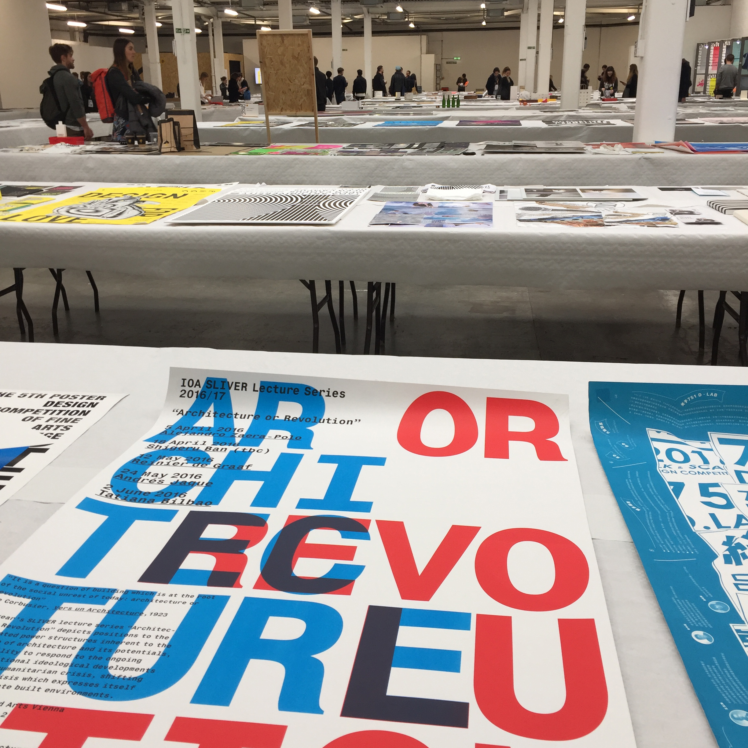
The 2017 D&AD festival, at the Old Truman Brewery in London, ran for 3 days from April 25-27 with over a hundred speakers. As well as the talks you could see all of the work entered for this year’s D&AD awards across Art Direction, Branding, Digital Design and lots more. This is a report from the things we saw on day 3 “Outrageous Magic: Our industry’s leading designers and creators talking about what they do when crafting the big ideas.”
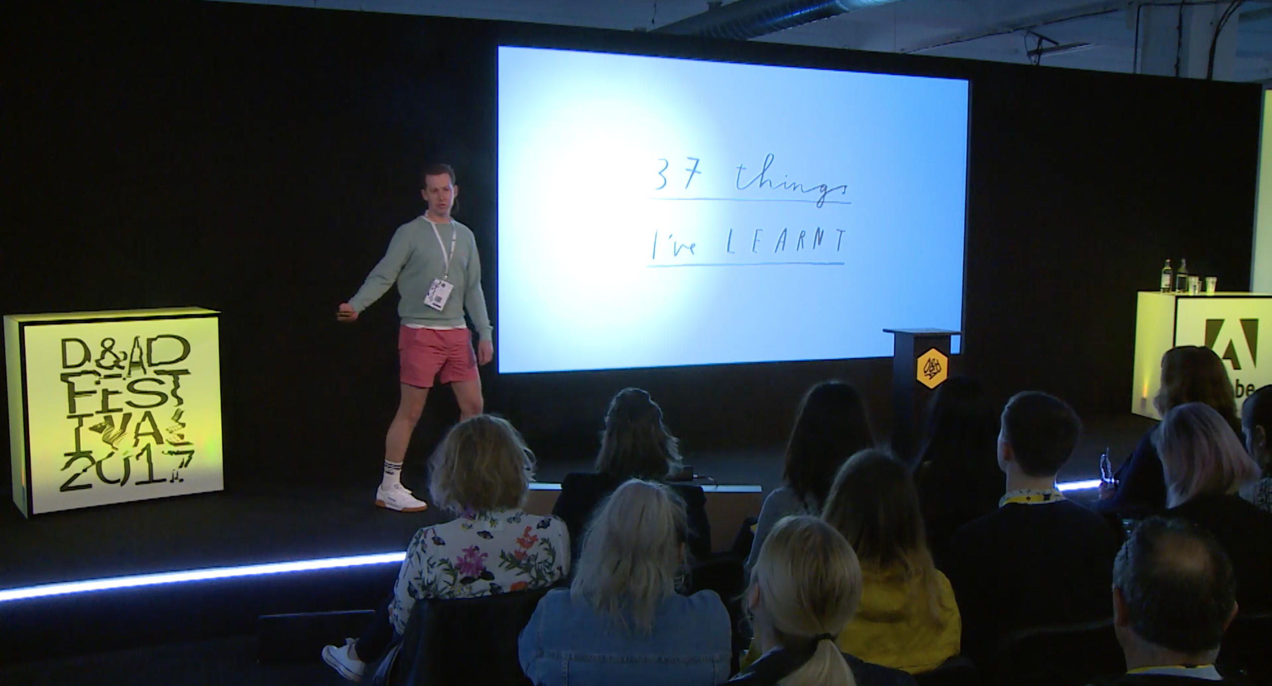
Mr Bingo – 37 thing’s I’ve learnt
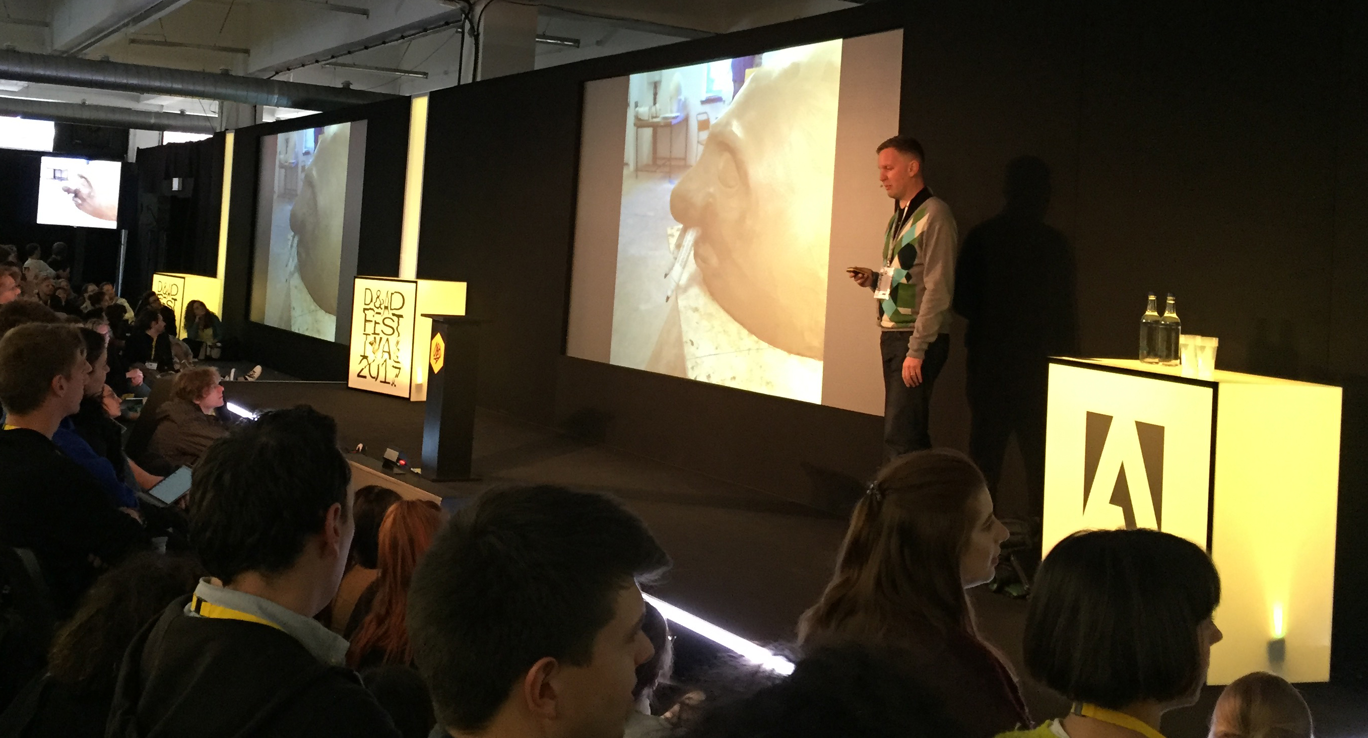
What a way to start the the day! I’ve seen Mr Bingo speaking before and I was happy to see his crazy childhood torture pictures again. Not pictures of his torture – his imaginary imaginings of ways to torture people in cartoon form. Just describing it sounds weird, but really it was about him expressing himself as a kid and his parents being totally supportive, even if his teachers thought he was a psychopath.
He had 37 things to share with us but I was too busy laughing to make note of most of them. One that struck a chord though was just to start something. Just start it. Start that idea. Create a new folder on your desktop and name it. You’ve started the project. I think it’s too easy to be paralysed somewhere between thinking the idea will be the best thing in the world and the worst thing in the world. The hope that it will be amazing and the fear that it will be terrible. Just start the the thing, then at least it has to be the potential to be something.
His Hate Mail project is one of the funniest things i’ve ever seen and he seems equally surprised by it success. People actually pay him to send them offensive postcards. Genius.
You can also watch his talk in full on the D&AD website
David Shrigley – Good ideas and bad ideas
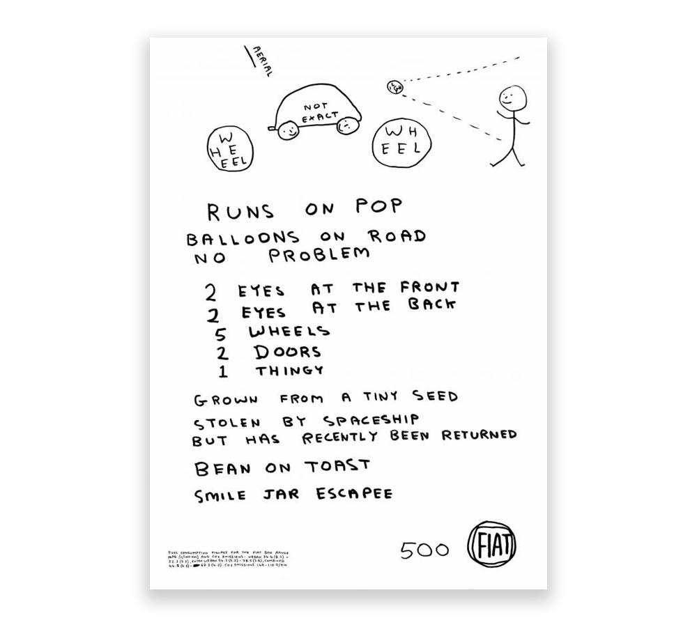
I’ve loved Shrigley’s surreal naive style drawings for years. I like the dark humour in his observations of life, even if they are a bit creepy. I do wonder if it’s actually difficult to draw ‘badly’. How do you remain free creatively having a naive style without getting any better at it? Is it a bit affected? Like a comedy accent. If you draw every day you get better at it but what does it mean to pursue a purposefully crap style? Are you commenting on image making in general or are you just funny? Shrigley is funny. I liked the crap ad for the Fiat500 he was commissioned for. It’s hilarious. He seems to be poking fun at advertising rather than selling the product though. “Runs on pop. Balloons on road. No problem.” He seemed as surprised as I was that Fiat actually ran the ad.
Shrigley is a more grown-up version of Mr Bingo really, in fact Mr Bingo jokes at the end of his talk he used to copy him. Seems a contradiction that the two most entertaining speakers are really artists, not D&ADers™.
Colleen DeCourcy – How to catch lightning in a bottle Wieden & Kennedy’s Colleen DeCourcy is a bit shouty. That’s all I have to say about her.
You can read a version of her talk over on Medium.
Morag Myerscough- Belonging
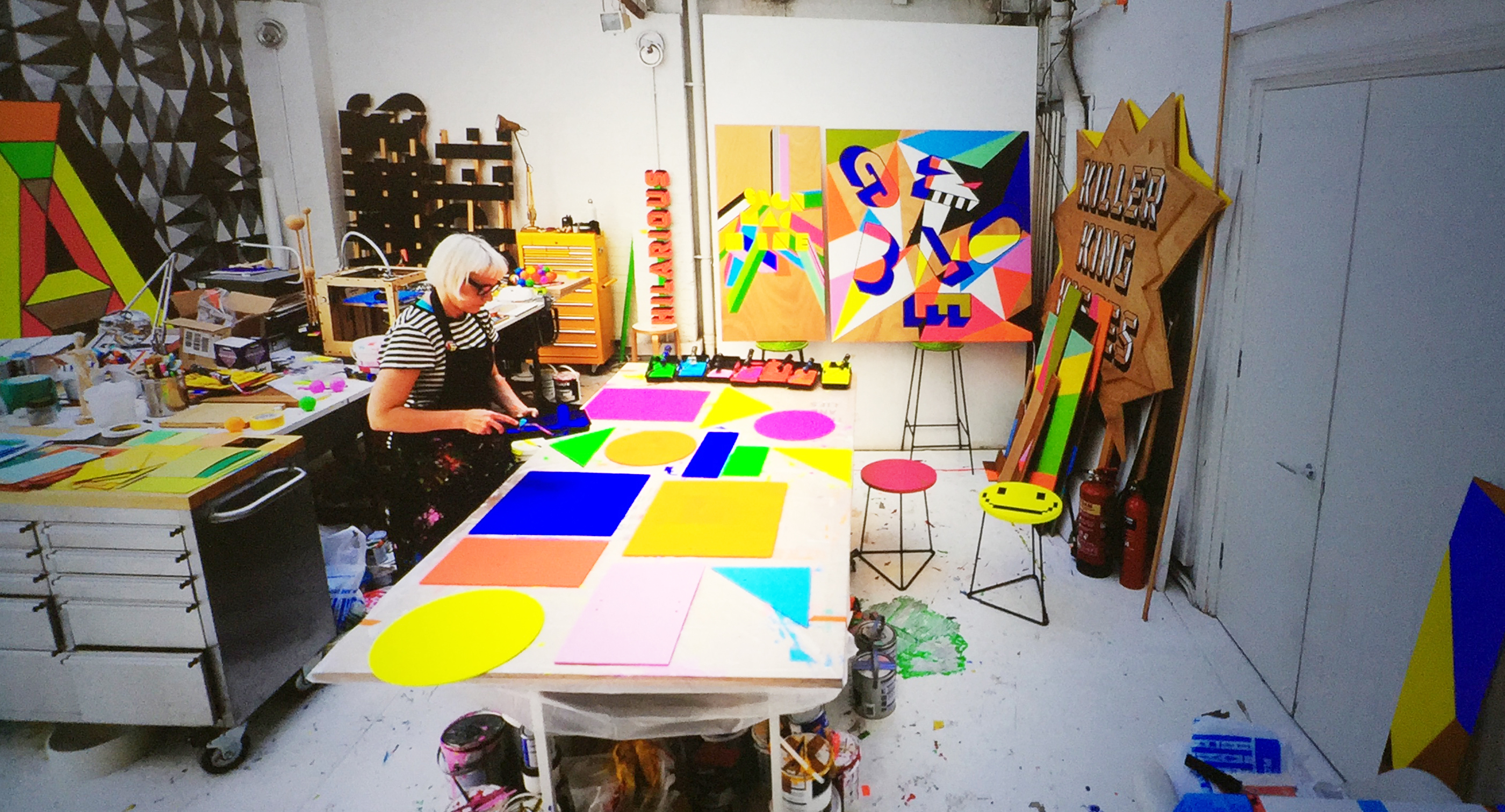
I love big, bold colourful type and Morag Myerscough knows how to do that with eye-popping style. Her work often integrates colourful graphics and type in and around public spaces and she has worked on installations, schools, hospitals, wayfinding systems and more.
Her talk focused on her working practice and how she goes about putting together huge projects with the help of volunteers and her punk musician partner.
I really liked the Temple of Agape project which was was part of the Festival of Love at the Southbank Centre, London. It was a temporary installation including an entrance and temple with new and unique views of the area. All constructed from scaffold and colourful wooden panels painted by Morag’s studio. There are some great photos of the project over on Archdaily.
The work
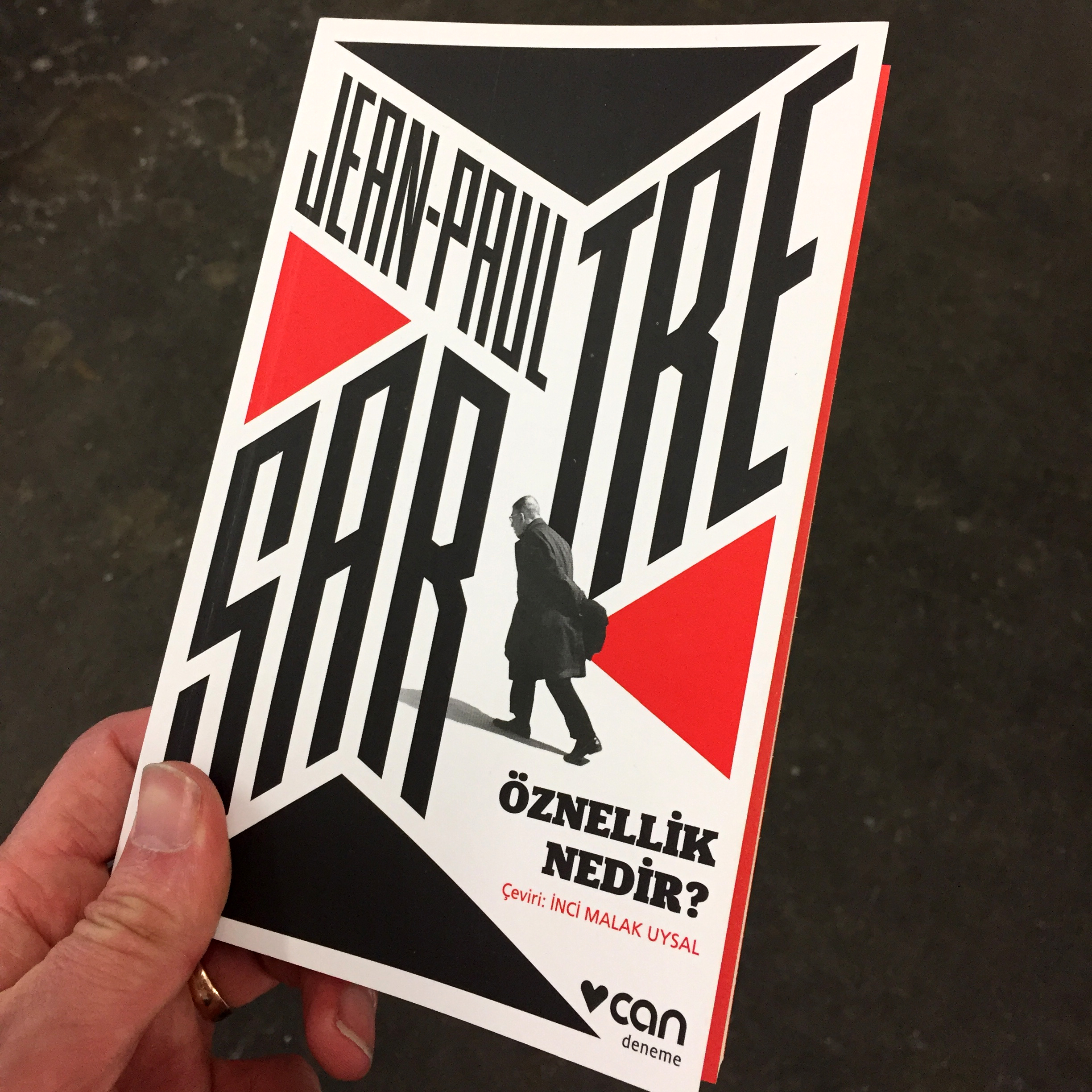
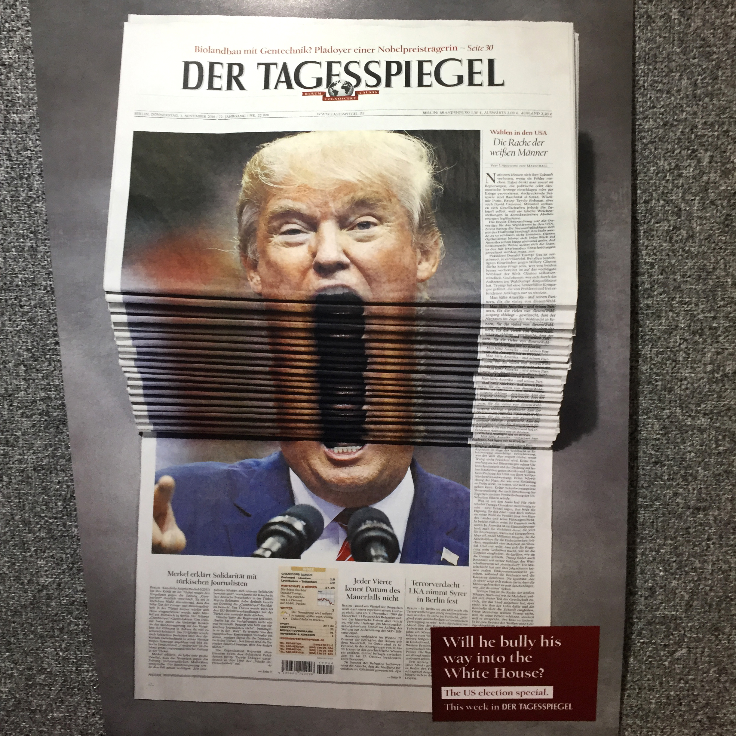
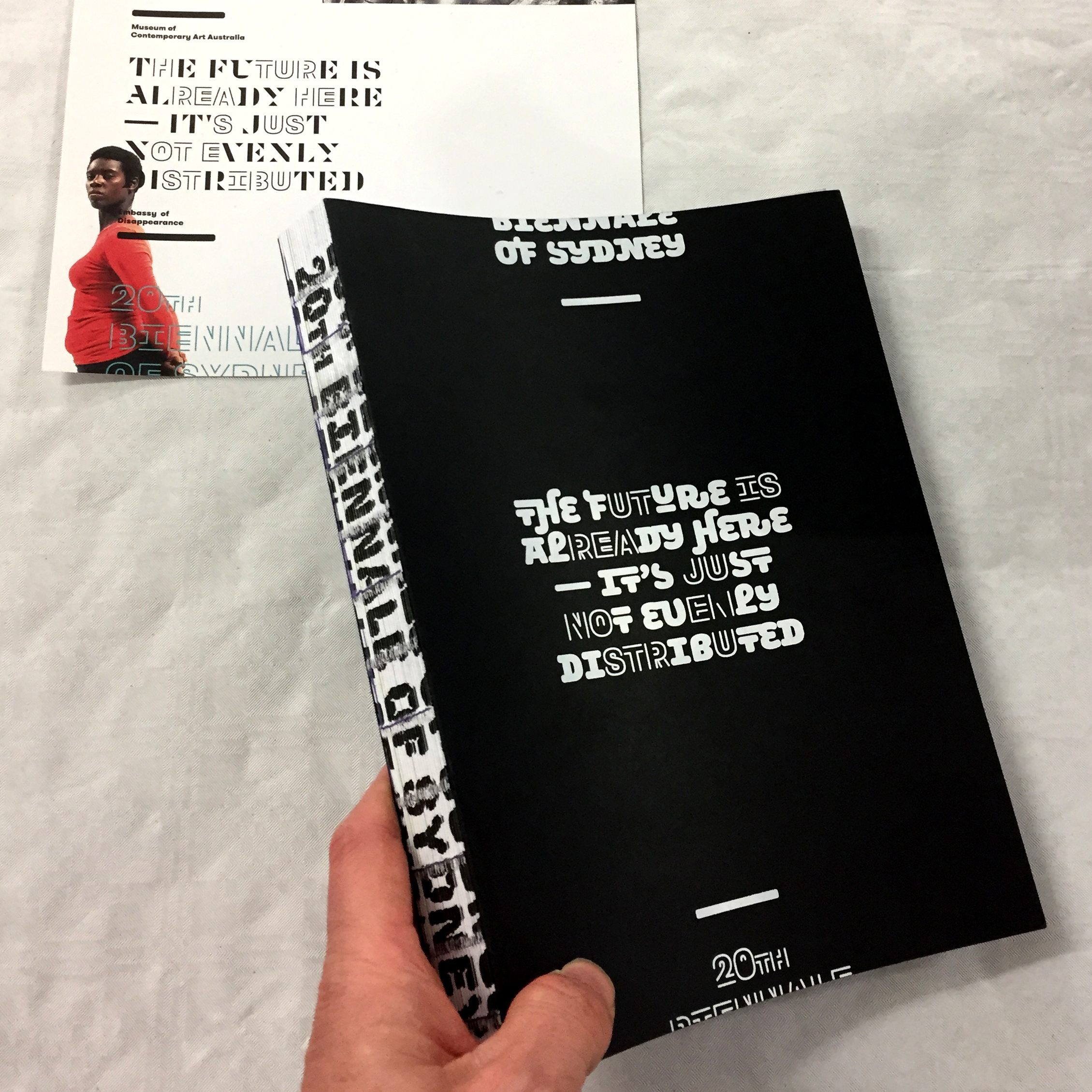
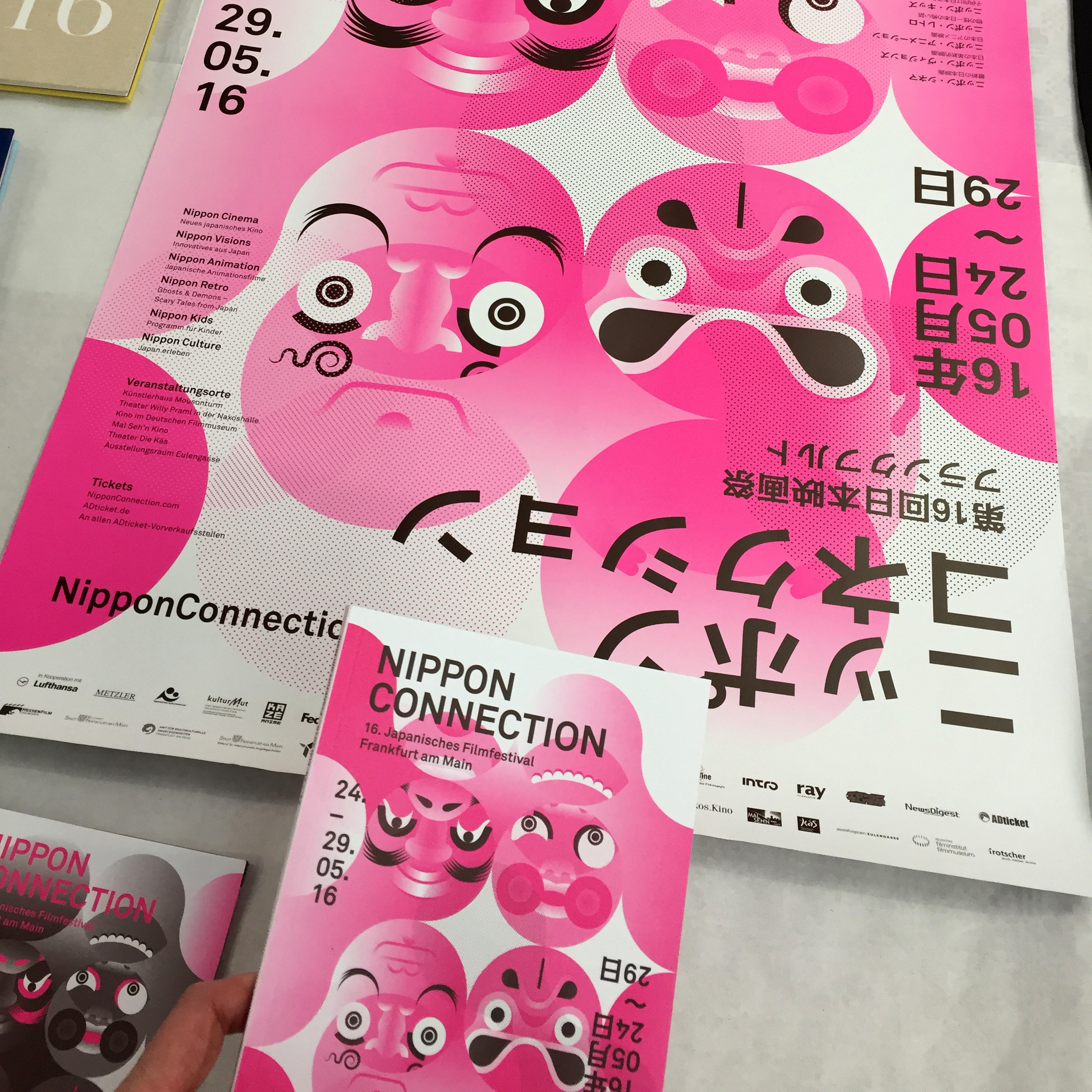
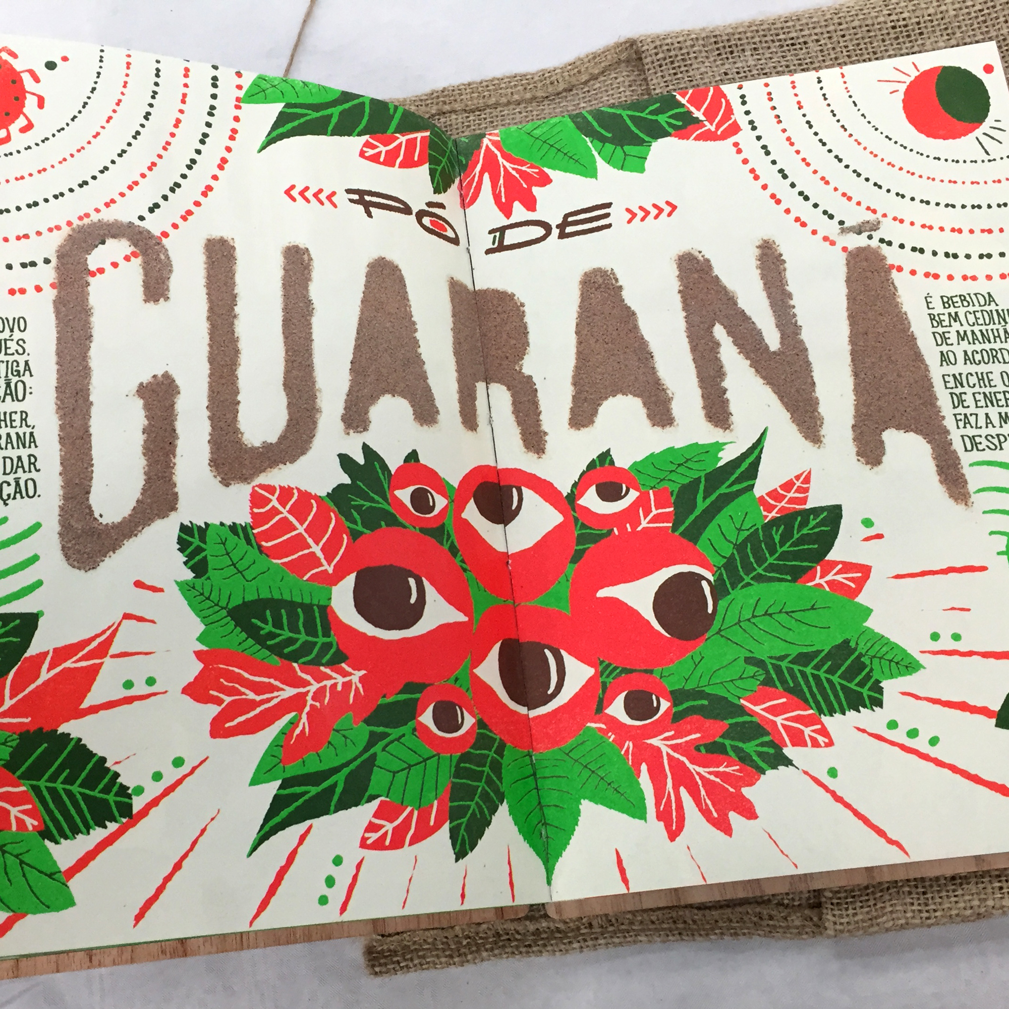
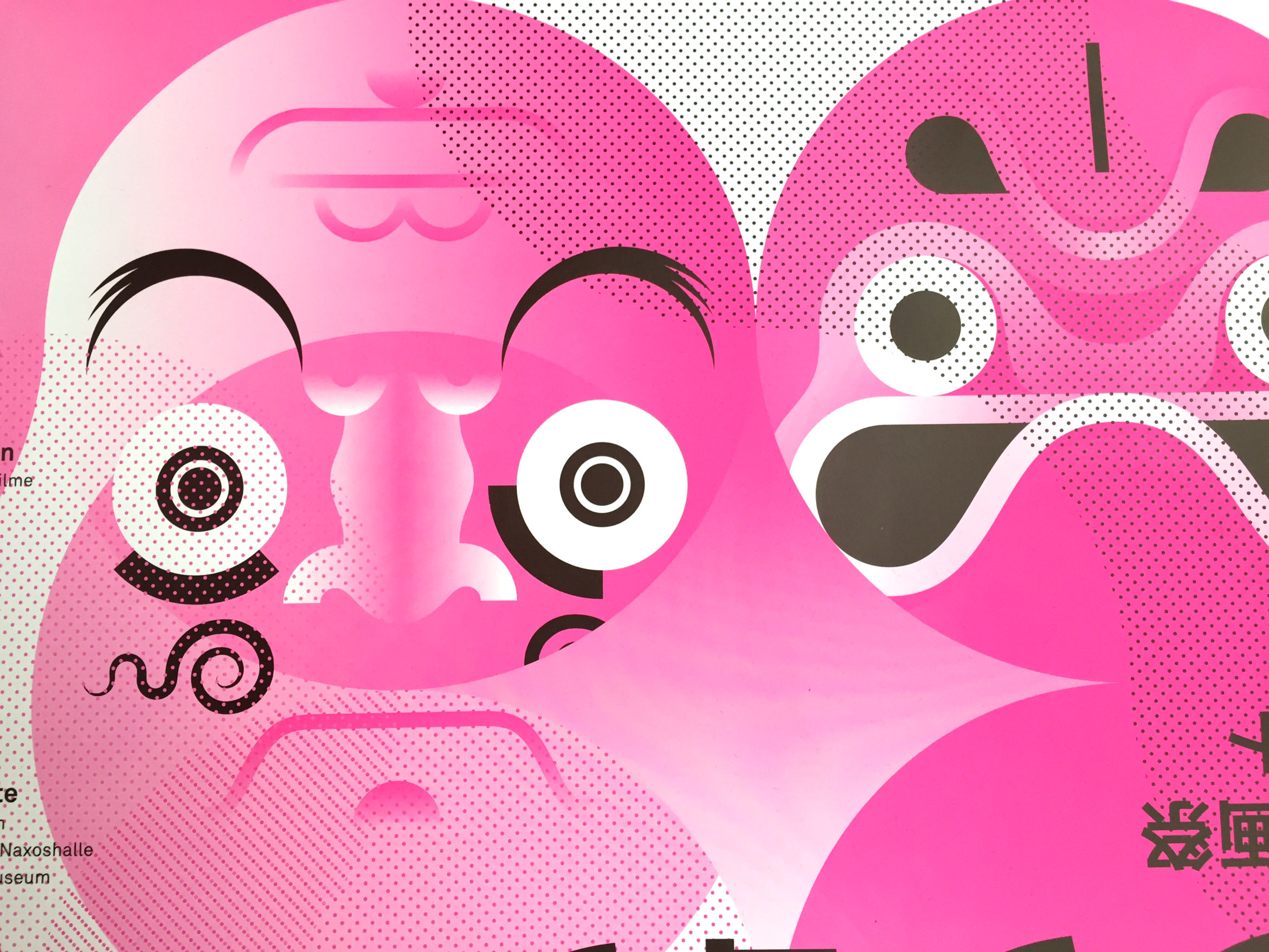
As well as the talks there was just a ridiculous amount of incredible work to see across Art Direction, Branding, Digital Design and lots more. Far too much to see on a single day in-between everything else. Below are a small selection of works that caught my magpie design-eye…
