Chill Factore is the UK's longest indoor ski slope based in Trafford Park, Greater Manchester. When the slope opened in 2007 it was the widest in the world, at 180 metres (590 ft) long and 100 metres (330 ft) wide. Chill Factore caters for anyone who has a love of all things snow, families, beginner skiers and boarders through to professionals and adrenaline junkies. It's an alpine experience on the doorstep of Greater Manchester.
Ramp night
Ramp night is a freestyle event held at Chill Factore where they use a variety of ramps and rails for skiers and snowboards to polish up and showcase tricks and aerials as well as learn new moves from other freestylers. It's a popular event in the uk skiers and boarders community, a warmup before hitting the slopes on their next winter holiday.
The brief
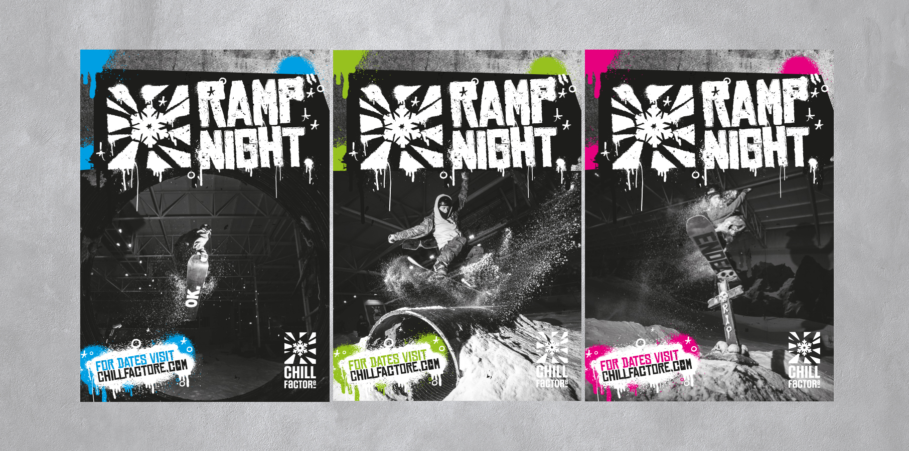
Chill Factore were looking to revamp and freshen up their freestyle branding. The audience for freestyle is considerably more hard core, energetic and engaged than Chill Factore's family ski proposition, we quickly decided to create a visual brand differentiator by stepping away from the bright & vibrant colours typically used in the Chill Factore brand for events & promotions. The identity of Ramp Night needed to engage a grungy, freestyle boarding audience.
Our approach
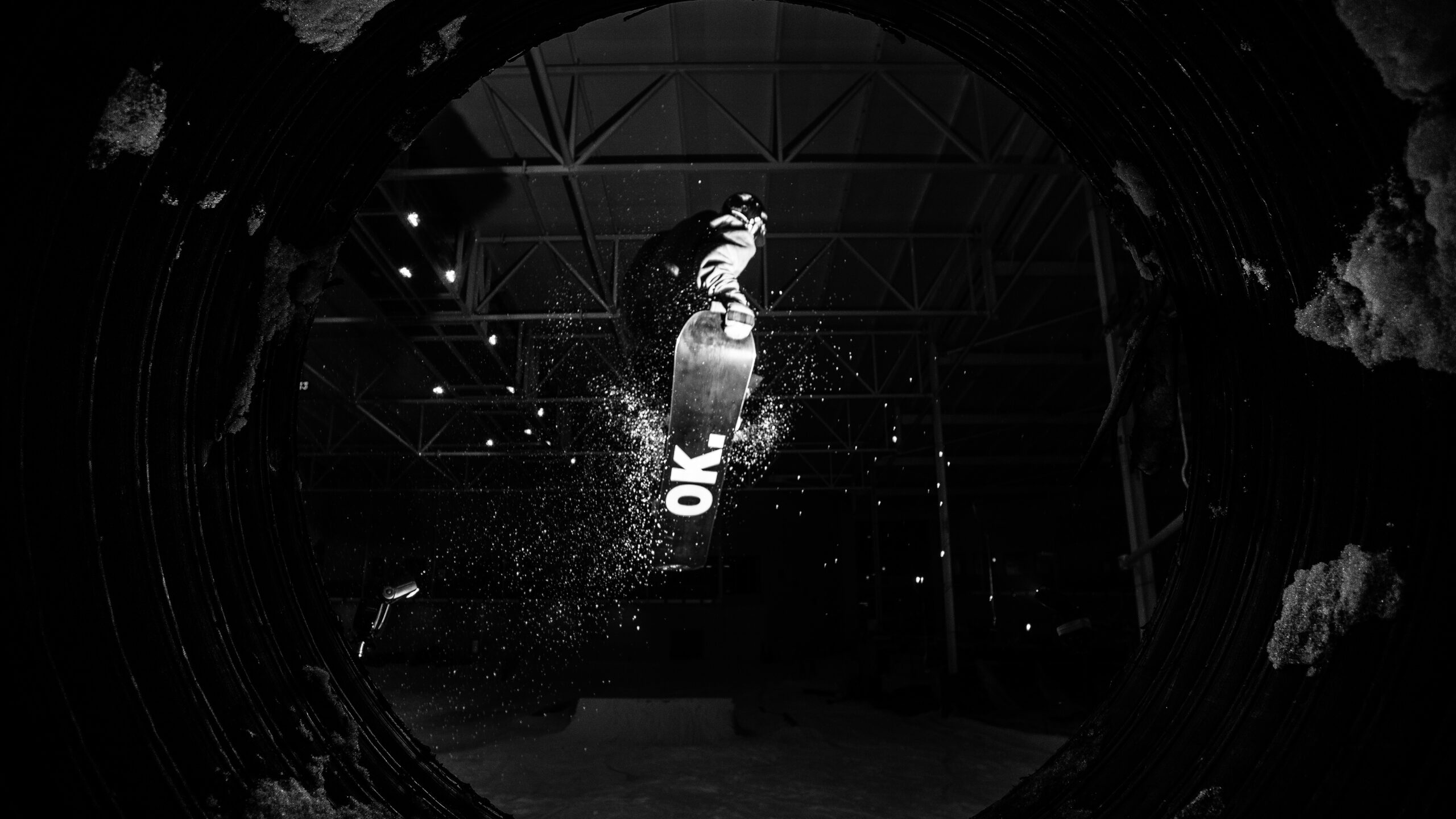
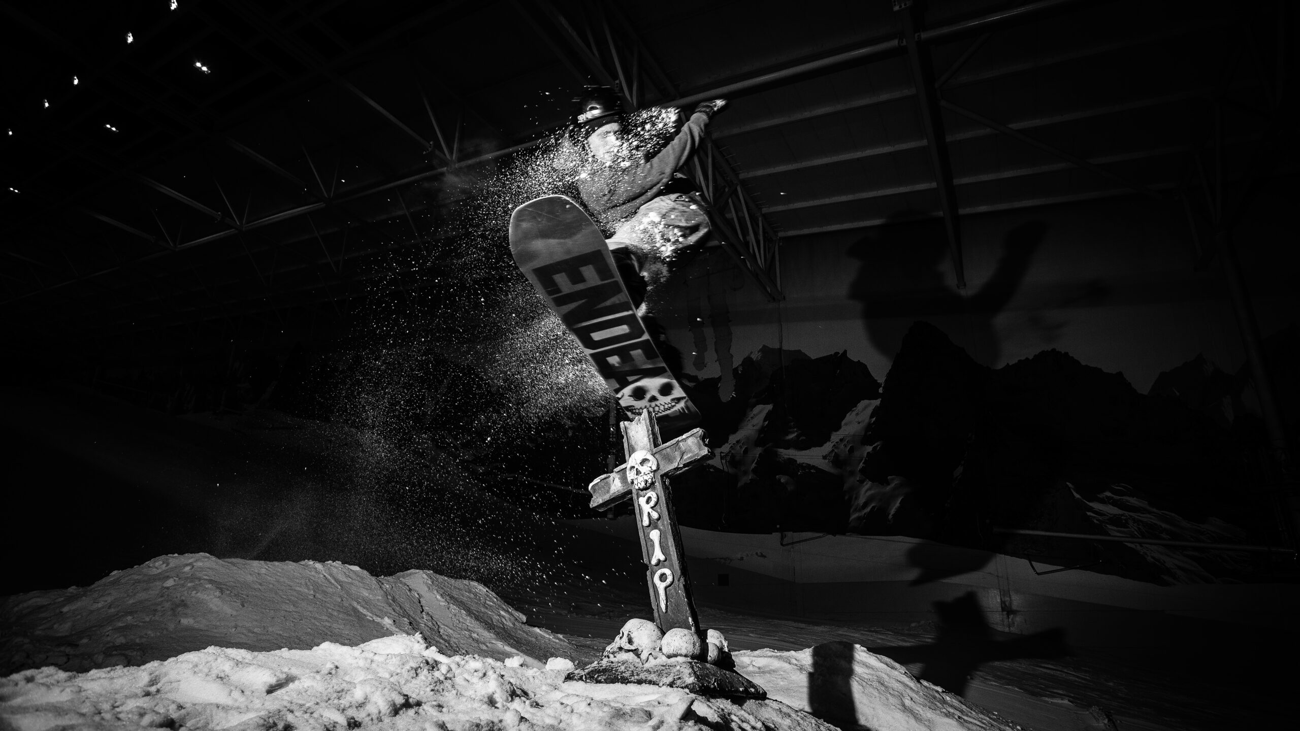
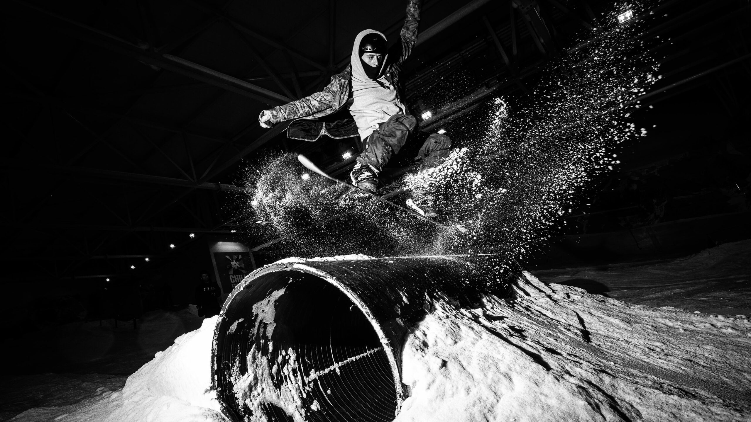
We started by developing several scamped ideas, created as rough visuals in various layouts, fonts and colour options before progressing to a more refined concept. After performing some competitor research and looking at the identities of various brands associated with freestyle skiing and snowboarding, we decided on a dark and moody approach to the style of photography we wanted to use. Looking at previous freestyle events at Chill we came across some great images taken by Bluebird Photography that we subverted a little and used in the final artwork.
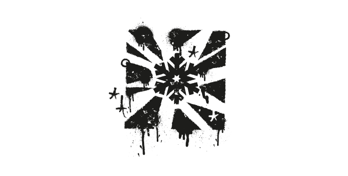
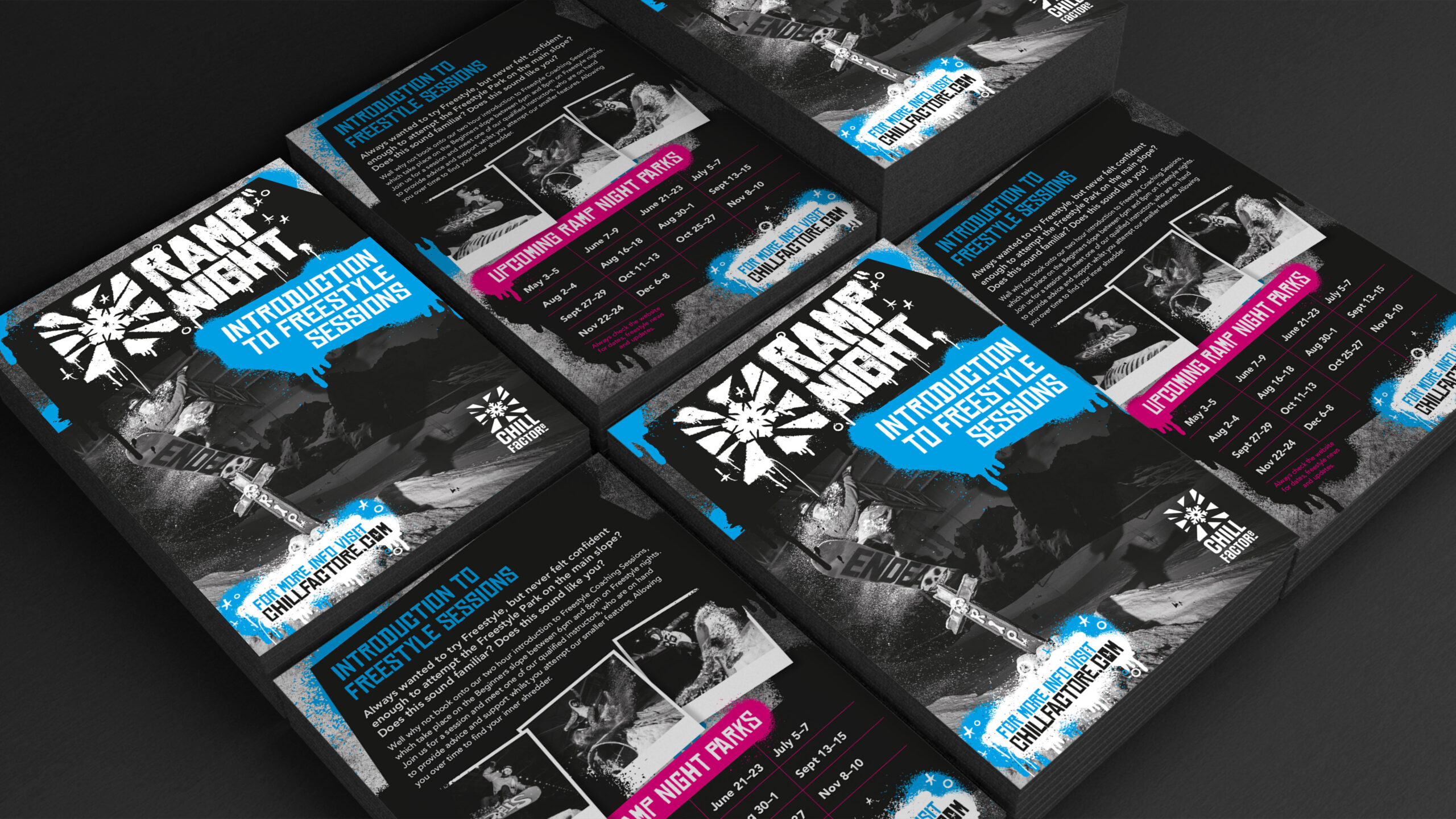
Once we had a style idea defined we started by creating a new logo for Ramp Night. In a bold move, we decided to develop a sub brand from the original Chill Factore logo. The main reason for this was make it look unmistakably Chill Factore but less playful, more serious. To facilitate this look we created a distressed and distorted Chill Factore logo with paint drips and splatters to give the desired ‘grunge’ look. This design language was then developed into a more formed visual identity for leaflets, the website image assets and posters to promote the events.
Park Plan
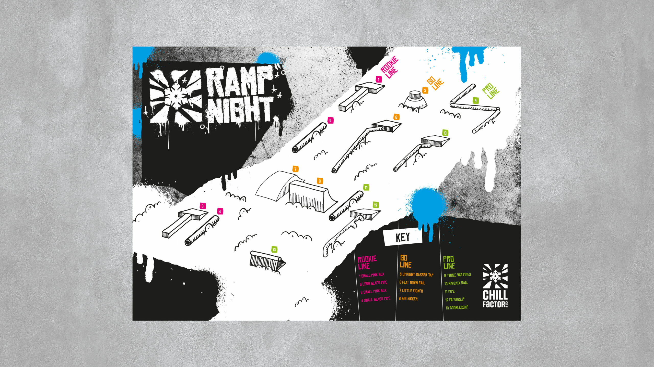
The marketing team at Chill Factore also required a new park plan to show their customers where ramps and rails were going to be positioned on the course each week. The park plan needed to be designed in a modular way, so that we could change and move items around depending on what was going and and how it was to be used.
Both ourselves and Chill Factore wanted the illustrations to have a hand drawn look and feel which would compliment the new visual identity for Ramp Night that we’d already created. To add interest we sketched them in 3D and colour coded each line by area of difficulty, so it’s easy for customers define which line would be best suited to their experience.
