Interfix are customer-focused, industry professionals and problem solvers. They are dedicated to supplying the construction and refurbishment industries with equipment, product and tool requirements without any hassle.
The brief
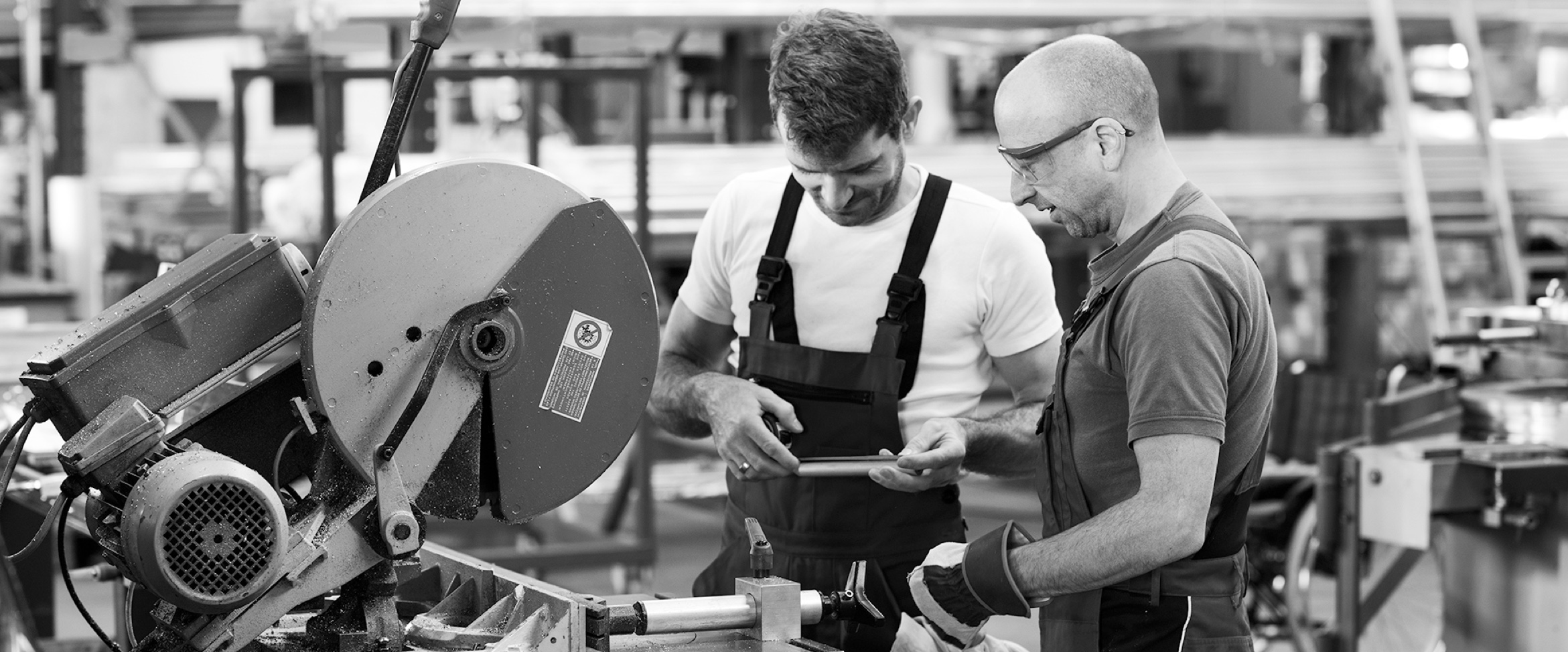
Interfix had a website that had become outdated and was in need of a refresh. They needed to reflect the fact that they’re a successful, fast-growing business. We took their current brand and refreshed the logo slightly. We also introduced photography, iconography and a modern style that could be used across web and print.
Visit Website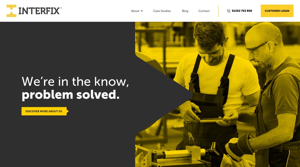
The style
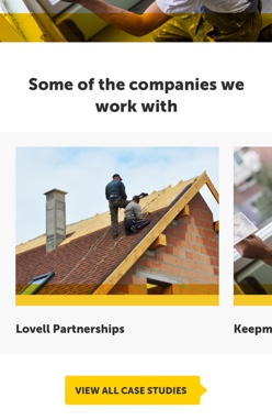
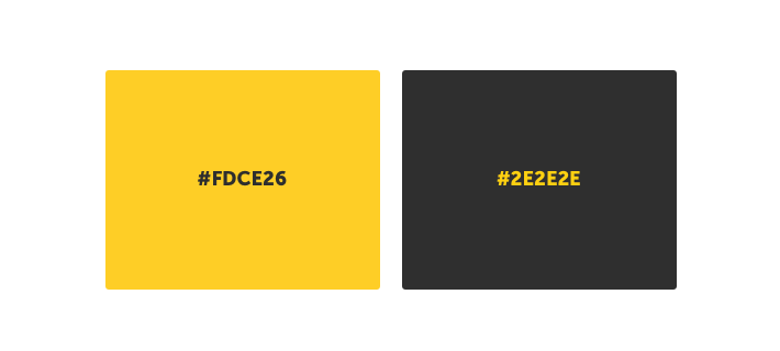
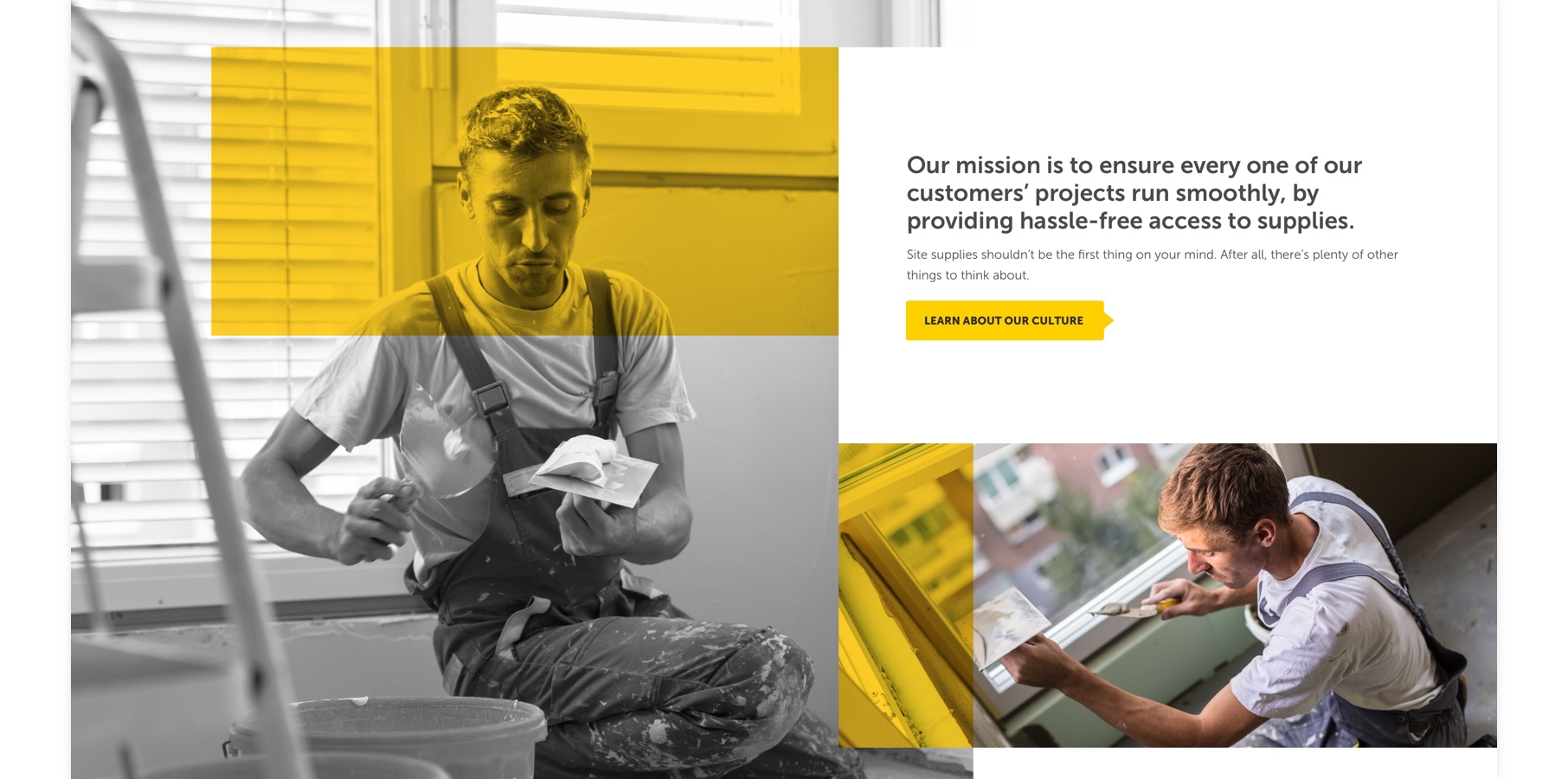
The new style is modern, bold and professional. We combined bright yellow shapes with professional photography allowed us to create distinctive and abstract layouts, which really suits their company and gives them a definitive style.
Easy navigation and content
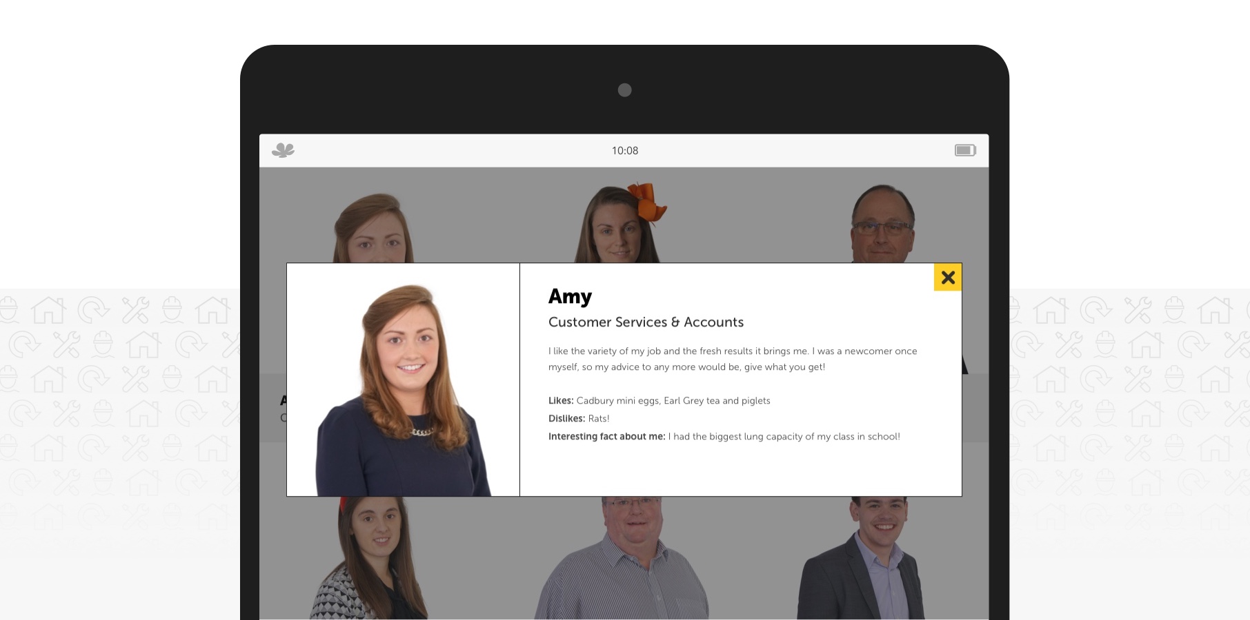
The old website had a lot of information on some pages, or no information on others. We came up with a new sitemap that allowed content to be split up over more relevant pages, and had a big focus on telling the user exactly what Interfix does, who they supply to, and why they’re different. We also introduced a dedicated area for case studies, as Interfix work with many well-known companies, we wanted them to be able to showcase their work!
The outcome
Interfix now have a refreshed, vibrant brand to go alongside their website. Their new website is clean, easy to navigate and provides possible customers with plenty of information and case studies to give evidence of the work that they do.
