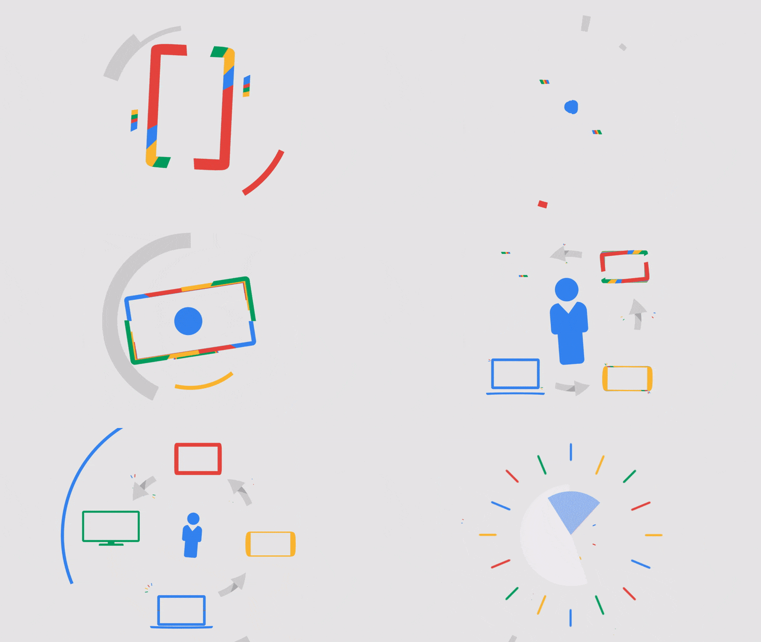
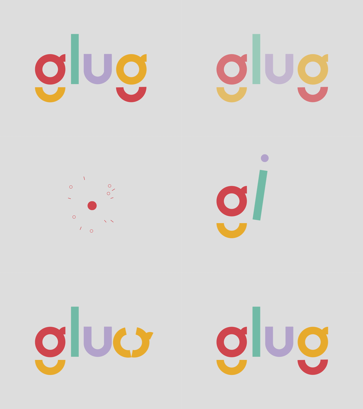
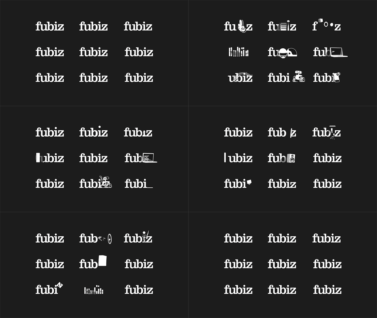
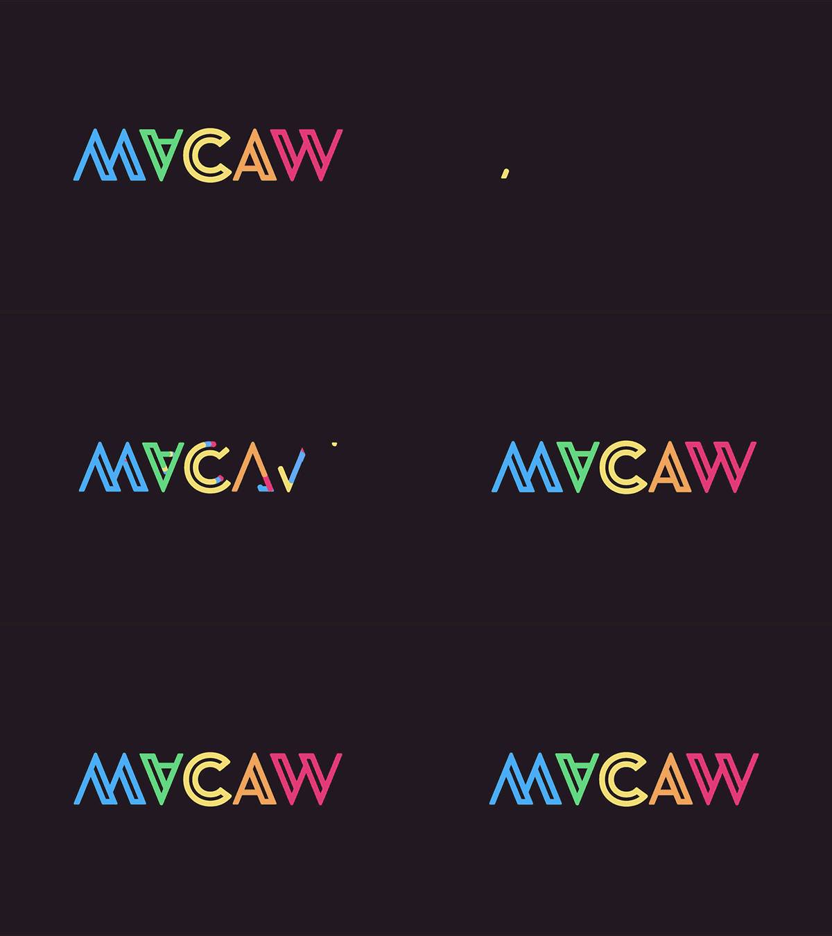
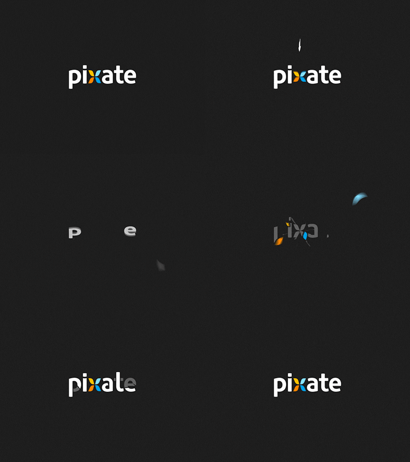
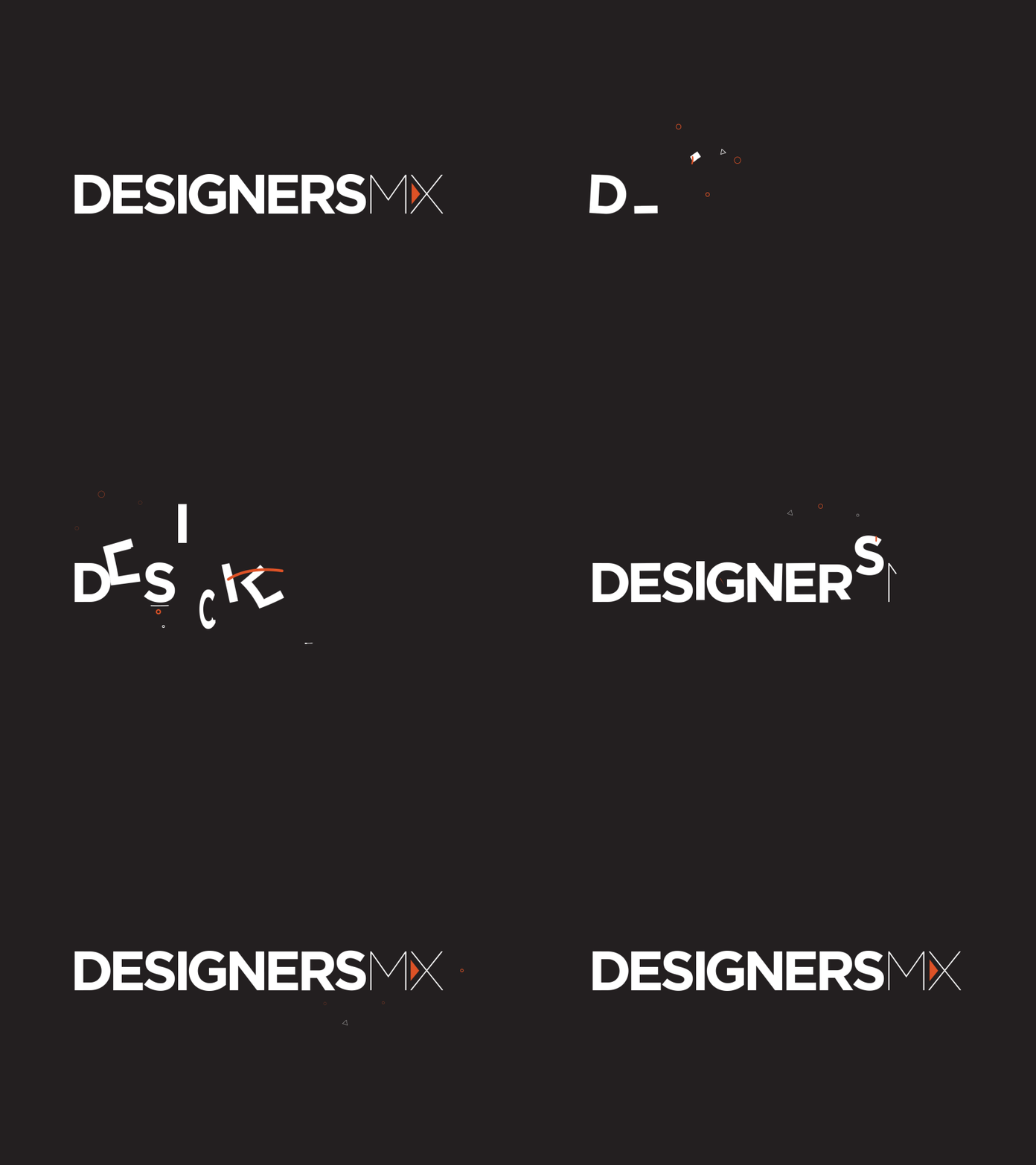
When branding, graphic design and motion graphics collide, magical things can happen.
These lovable loopy animations are often known in the trade as Motion Idents or Brand Idents, a term borrowed from their Granddaddy’s in the television broadcast media where they are affectionately known as… Yes you guessed it Television Idents.
In this short article we wanted to showcase some of the inspiring brand idents that we’ve noticed on our travels. When animation looks effortlessly beautiful it is most definitely an indicator of the contrary, when only pure blood, sweat and tears can make the grade. The following gallery of brand idents were created by digital artists at the top of their game, pouring over every frame of detail. Our list here showcases examples that are graphic art and typographical, we’d guess most were created using a combination of Adobe Illustrator and After Effects with the odd dash of a 3D application like Maya, Cinema4d or Studio Max, a recipe of tools that we often use ourselves to accomplish such daring feats of digital dashing.
Animating logo and type can set an Art Directors imagination on fire and in deftly skilled hands motion stirs emotion.
Anyways, enough of our waffle, let the show begin…

