Another successful web launch
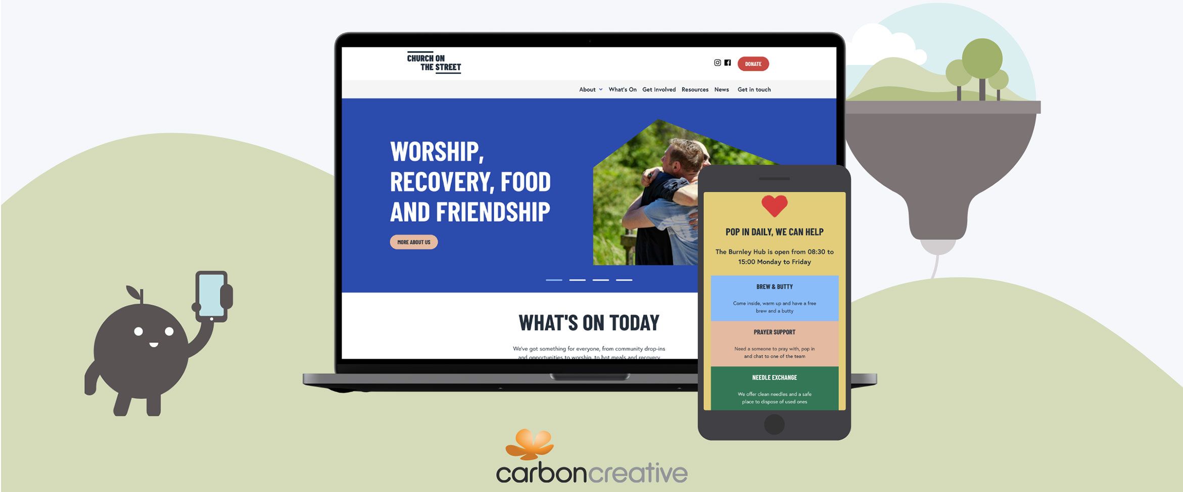
We’ve been super busy behind the scenes working on some amazing brand and web work – so much so that we almost forgot to tell you about it! Now that we’ve managed to catch our breath, we wanted to showcase one project that we’re particularly proud of. We feel it really does the talking for us and showcases what we’re all about here at Carbon.
Church on the Street (also known as COTS) is an organisation in Burnley that works tirelessly to ensure that everyone, no matter their circumstances, has access to a safe place. For some, that safe place might simply mean a place to stay warm. For others, it could be an opportunity to chat in a non-judgemental manner, to develop their relationship with God, or to access mental or physical support. Burnley is local (with a few team members having spent a few years living there 😉), so we definitely knew we needed to hop on over and see what COTS is truly all about.
The value of a strong client relationship
We first met Chris at COTS through a previous job we’d worked on a few years earlier. It’s always great to see familiar faces, and discover what they’re now up to! As COTS are local to Carbon, we did have the benefit of engaging in face to face meetings, both at our office in MediaCity and down at the church. We feel that this really did improve our understanding of the project – but it also changed how we even approached it.
When visiting COTS, we got to see just how much support is truly on offer to local people. We felt that this wasn’t expressed well on COTS’ previous website. But… we also realised this wasn’t being showcased in the designs Carbon was working on at the time. We decided to take our discoveries on board and make amends suggestions to the client. These changes did impact some of the homepage layout, and we feel the website really helps people know they can just go in for a chat or a brew – they don’t need to have a reason.
How will COTS benefit from their new web presence?
COTS needed a new website because they had outgrown their previous one. It did the job, but it wasn’t very flexible and it was difficult to make small content edits. As the church regularly changes their events based on feedback, it was really important this could be improved on. As the team was expanding, new staff and volunteers wanted to support with the website and marketing. We wanted to make sure this was as easy and simply for them as possible.
The website also features beautiful elements of COTS’ brand guidelines. We’re really proud of how we have integrated these into the project. We think the church’s personality shines through: they show themselves as warm, welcoming, and passionate. At the end of the day, we’re really hoping we helped in making a difference in people’s lives. We hope you will take a look at their brilliant work and consider donating.
Results…?
Of course we like our websites to look good, but we’re also interested in seeing how the new site performs. We’re pleased to see that the donation page is the fifth most viewed page. We’re also really pleased with the average engagement time of 2 min 39 s. People give websites notoriously low attention — it’s hard to realise as we are all so used to being on them! The website is also primarily viewed on mobiles. When working with charities, it’s important to keep this in mind in the design stage as people might find mobiles easier to access in private or might not have access to a desktop.
Look out for our full case study coming soon which includes an insight into what the team at COTS thought about working with us. 😀 If you have a web project you’d like to discuss with us, why not get in touch?
