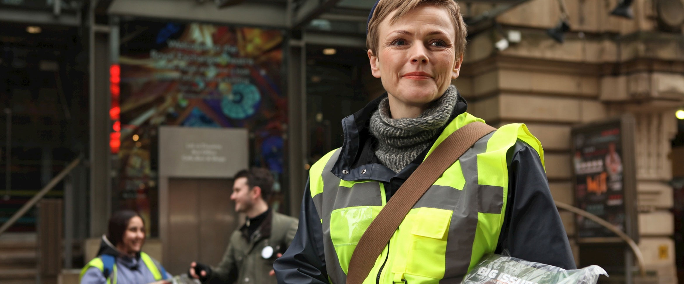
Big Issue North is an amazing organisation, producing interesting, credible news content, employing local people that help to produce and distribute a weekly magazine sold by street vendors who have limited ways of earning an income.
Big Issue North
We love working with BigLife Group, we've helped them on many different projects over a number of years. BigLife are an organisation that brings considerable social change, enriching lives and local communities. Big Issue North is perhaps their most well known brand in the UK and we were delighted to be entrusted with designing and developing a new website for their weekly magazine.
Visit Website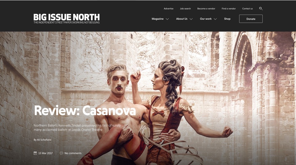
A fresh take
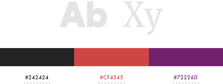
The idea behind the new site was to echo the magazine as much as possible - bringing together an already developed brand identity and presenting it in a fresh, modern style. We combined great photography with web-friendly typography to knit together the visuals for the new site. We love the bold colours of the Big Issue North brand, so we thought: "If it ain't broke..."
Engagement & awareness
The old Big Issue North website wasn’t responsive which meant it was difficult to use for for a large majority of visitors to the site. With that in mind, we paid special attention to the user experience on mobile devices; with interactive wireframes, low and high-fidelity designs all playing a part in creating a great experience for existing and new users.
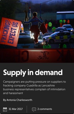
With the magazine being published weekly and articles written and uploaded on a daily basis, it was important that we made the site as easy to update as possible, allowing editors and administrators to choose featured stories for the home page. Along with the constantly changing content and our ‘trending articles’ section, it means the website never appears to be stale; increasing user interaction and engagement.
Carbon and Big Issue North shared a common vision that the website should not only showcase their editorial work, but also giving just as much attention their community and charity work, highlighting their sellers and the people they work closely with. We designed and developed the site with this dual focus in mind – using their brand colours: red for editorial sections and purple for their work.
It was important to highlight to the public that Big Issue North is not just a magazine – it is a business solution to a social problem – giving its sellers the opportunity to earn an income and help increase their motivation and boost their self-esteem.
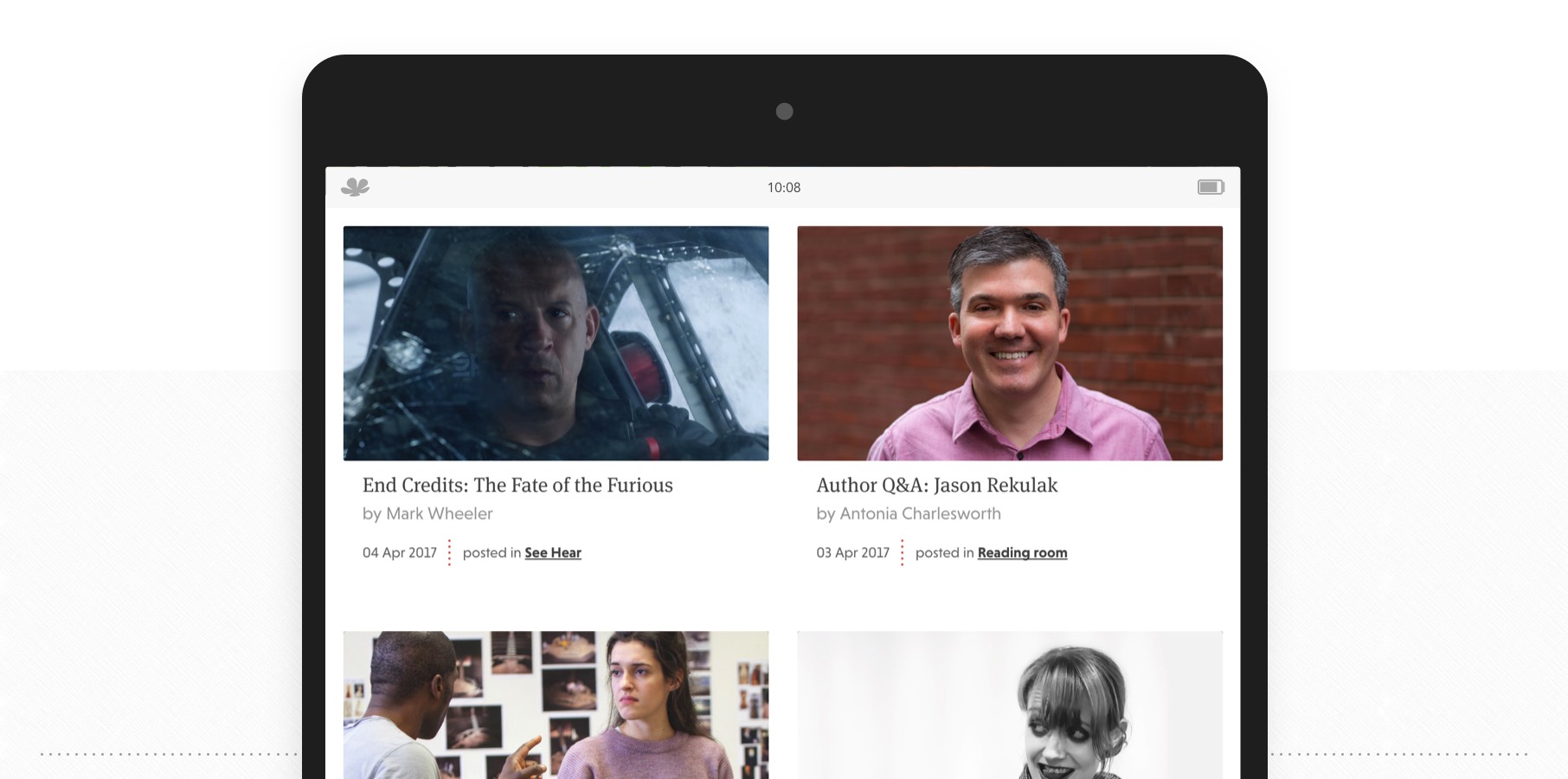
Incredible photography
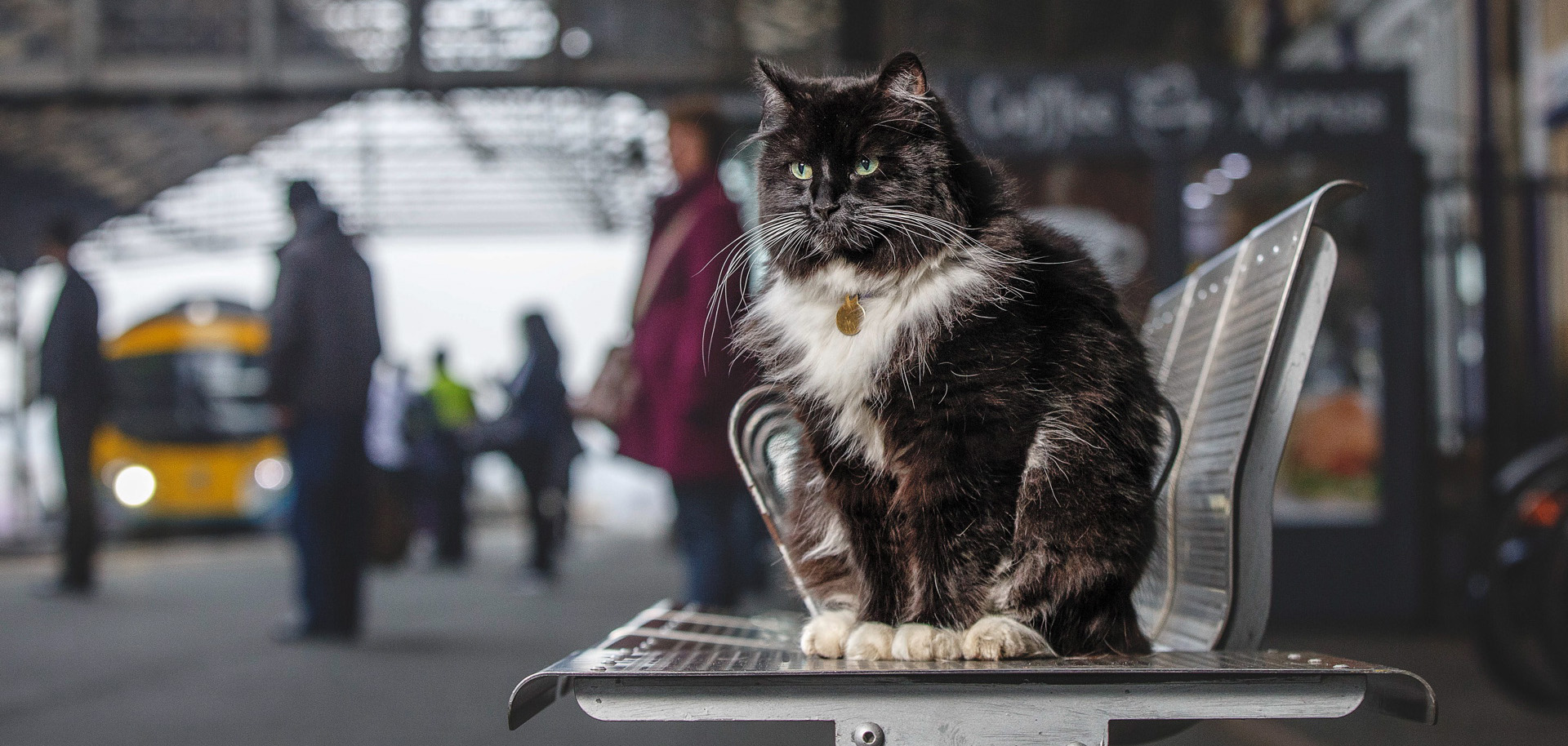
We really wanted to make more of the amazing photography that’s in the magazine, so decided on using a large featured image for each article on the site – so that the image would essentially take over the page.
… this lead to some technical challenges – we had to ensure that the site was just as quick on mobile networks as it was over a broadband connection. We do love a challenge!


The outcome
The new Big Issue North website achieves all of the goals that were set out at the beginning of the project. It's engaging, inviting and simple to use, and we feel that they now have a website perfectly matches their magazine.
